This lesson teaches you to
Try it out
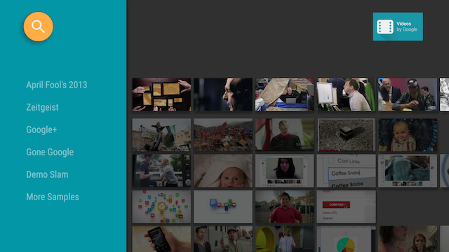
In the previous lesson, you created a catalog browser, implemented in a browse fragment, that displays a list of media items. In this lesson, you create the card views for your media items and present them in the browse fragment.
The BaseCardView class and subclasses display the meta
data associated with a media item. The ImageCardView
class used in this lesson displays an image for the content along with the media item's title.
This lesson describes code from the Android Leanback sample app, available on GitHub. Use this sample code to start your own app.

Figure 1. The Leanback sample app browse fragment with a card presenter displaying card view objects.
Create a Card Presenter
A Presenter generates views and binds objects to them
on demand. In the browse fragment where your app presents its content to the user, you create a
Presenter for the content cards and pass it to the adapter
that adds the content to the screen. In the following code, the CardPresenter is created
in the onLoadFinished()
callback of the LoaderManager.
@Override
public void onLoadFinished(Loader<HashMap<String, List<Movie>>> arg0,
                           HashMap<String, List<Movie>> data) {

    mRowsAdapter = new ArrayObjectAdapter(new ListRowPresenter());
    CardPresenter cardPresenter = new CardPresenter();

    int i = 0;

    for (Map.Entry<String, List<Movie>> entry : data.entrySet()) {
        ArrayObjectAdapter listRowAdapter = new ArrayObjectAdapter(cardPresenter);
        List<Movie> list = entry.getValue();

        for (int j = 0; j < list.size(); j++) {
            listRowAdapter.add(list.get(j));
        }
        HeaderItem header = new HeaderItem(i, entry.getKey(), null);
        i++;
        mRowsAdapter.add(new ListRow(header, listRowAdapter));
    }

    HeaderItem gridHeader = new HeaderItem(i, getString(R.string.more_samples),
            null);

    GridItemPresenter gridPresenter = new GridItemPresenter();
    ArrayObjectAdapter gridRowAdapter = new ArrayObjectAdapter(gridPresenter);
    gridRowAdapter.add(getString(R.string.grid_view));
    gridRowAdapter.add(getString(R.string.error_fragment));
    gridRowAdapter.add(getString(R.string.personal_settings));
    mRowsAdapter.add(new ListRow(gridHeader, gridRowAdapter));

    setAdapter(mRowsAdapter);

    updateRecommendations();
}
Create a Card View
In this step, you build the card presenter with a view holder for the card view that describes your media content items. Note that each presenter must only create one view type. If you have two different card view types then you need two different card presenters.
In the Presenter, implement an
onCreateViewHolder()
callback that creates a view holder that can be used to display a content item.
@Override
public class CardPresenter extends Presenter {

    private Context mContext;
    private static int CARD_WIDTH = 313;
    private static int CARD_HEIGHT = 176;
    private Drawable mDefaultCardImage;

    @Override
    public ViewHolder onCreateViewHolder(ViewGroup parent) {
        mContext = parent.getContext();
        mDefaultCardImage = mContext.getResources().getDrawable(R.drawable.movie);
...
In the onCreateViewHolder() method, create a card view for content items. The sample below uses an
ImageCardView.
When a card is selected, the default behavior expands it to a larger size. If you want to designate
a different color for the selected card, call setSelected()
as shown here.
...
    ImageCardView cardView = new ImageCardView(mContext) {
        @Override
        public void setSelected(boolean selected) {
            int selected_background = mContext.getResources().getColor(R.color.detail_background);
            int default_background = mContext.getResources().getColor(R.color.default_background);
            int color = selected ? selected_background : default_background;
            findViewById(R.id.info_field).setBackgroundColor(color);
            super.setSelected(selected);
        }
    };
...
When the user opens your app, the Presenter.ViewHolder
displays the CardView objects for your content items. You need to set these to receive
focus from the D-pad controller by calling setFocusable(true)
and setFocusableInTouchMode(true).
...
    cardView.setFocusable(true);
    cardView.setFocusableInTouchMode(true);
    return new ViewHolder(cardView);
}
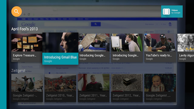
When the user selects the ImageCardView, it expands
to reveal its text area with the background color you specify, as shown in figure 2.

Figure 2. The Leanback sample app image card view when selected.